How We Animated Trillions of Tons of Flowing Ice
Antarctica is blanketed by mind-numbingly large amounts of ice. We tend to think of the continent as static and unchanging, but most of its ice is in constant motion, crawling downhill towards the sea.
The New York Times sent a reporter and three graphics editors to Antarctica in December. The team came back with astounding stereographic 360 video that they crafted into four beautiful VR films. But we wanted to make sure that the web presentation was also engaging, especially for folks who might miss the films.
Ice on the move was a vital part of the story, and it seemed like an idea that would immediately draw readers in, if we could just find the right way to visualize it.
My colleague Jeremy White was working on 3D graphics of ice movement to accompany our VR films, so he had already tracked down ice velocity data from the NSIDC:
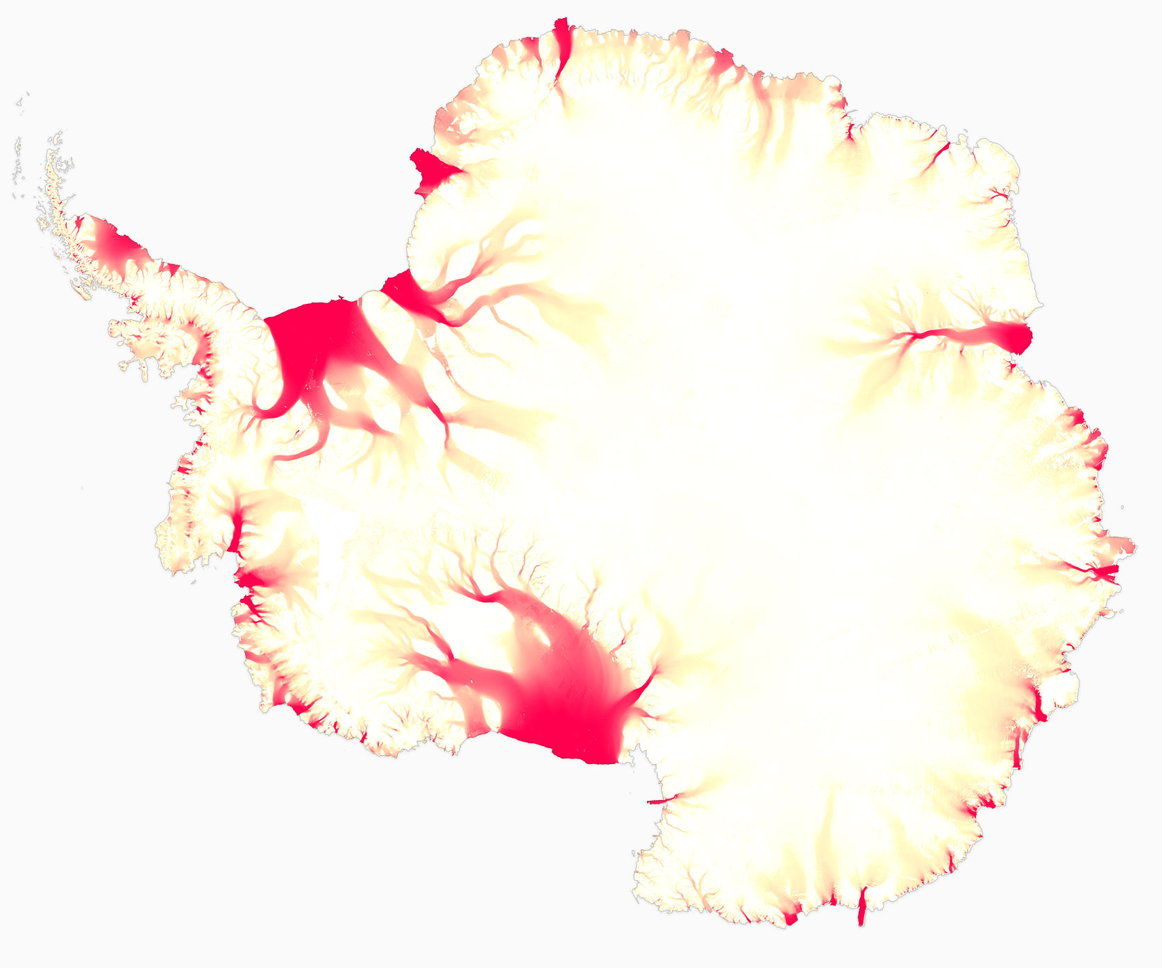
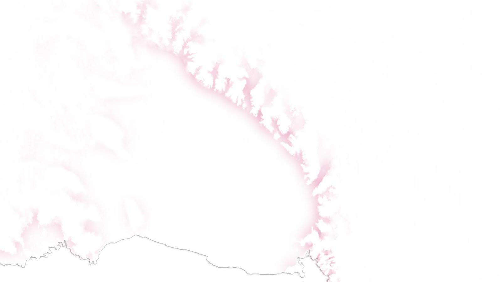
We would usually visualize this sort of data for the web using a static map like the one above, where colors represent the speed of the ice. But if you want to show how ice moves, why not use movement?
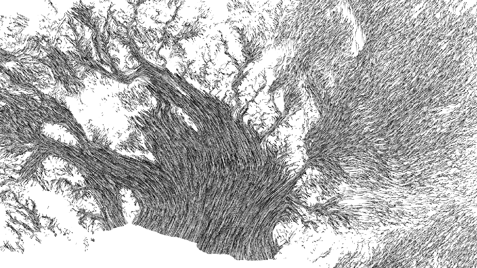
For the films, Jeremy wrote Java code that animated the paths of particles dropped onto the ice sheet along bezier curves derived from the velocity data. The result was a beautifully smooth 3D animation of how ice flows across the continent:
The movement felt vital to the visualization, and we wanted to repurpose some version it for the web. We knew we wanted something that looked great while still loading as quickly as possible for mobile readers. Video is an obvious first choice for animations on the web, but the files are somewhat large, have implementation issues when used for ambient auto-playing animations, and can look a bit fuzzy for data visualizations. Gifs were out too - the files would have been way too big.
We decided we'd try to render the ice flow animations live, in the browser. Recent mobile devices have great GPUs: graphics and video processing chips that efficiently render all of those YouTube videos and games of Candy Crush. Leveraging the graphics abilities of those chips could give us a leg up.
We thought a bit about how best to translate Jeremy's VR animations to the browser. At first, we considered reading in his bezier curves as vector shapes and animating flow along the paths, but way too much data would have been required for the level of detail we wanted for our maps.
After kicking around a few other ideas I vaguely remembered having seen an example online of color cycling, an old method for efficiently animating scenes in 8-bit games by shifting color palettes. The useful takeaway of that technique is that a static image can encode apparent motion if you change how its colors are represented:
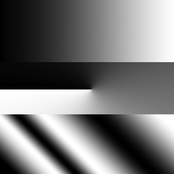
The underlying data doesn't change, just the representation of it. Apply the same technique to a photo and you get this:
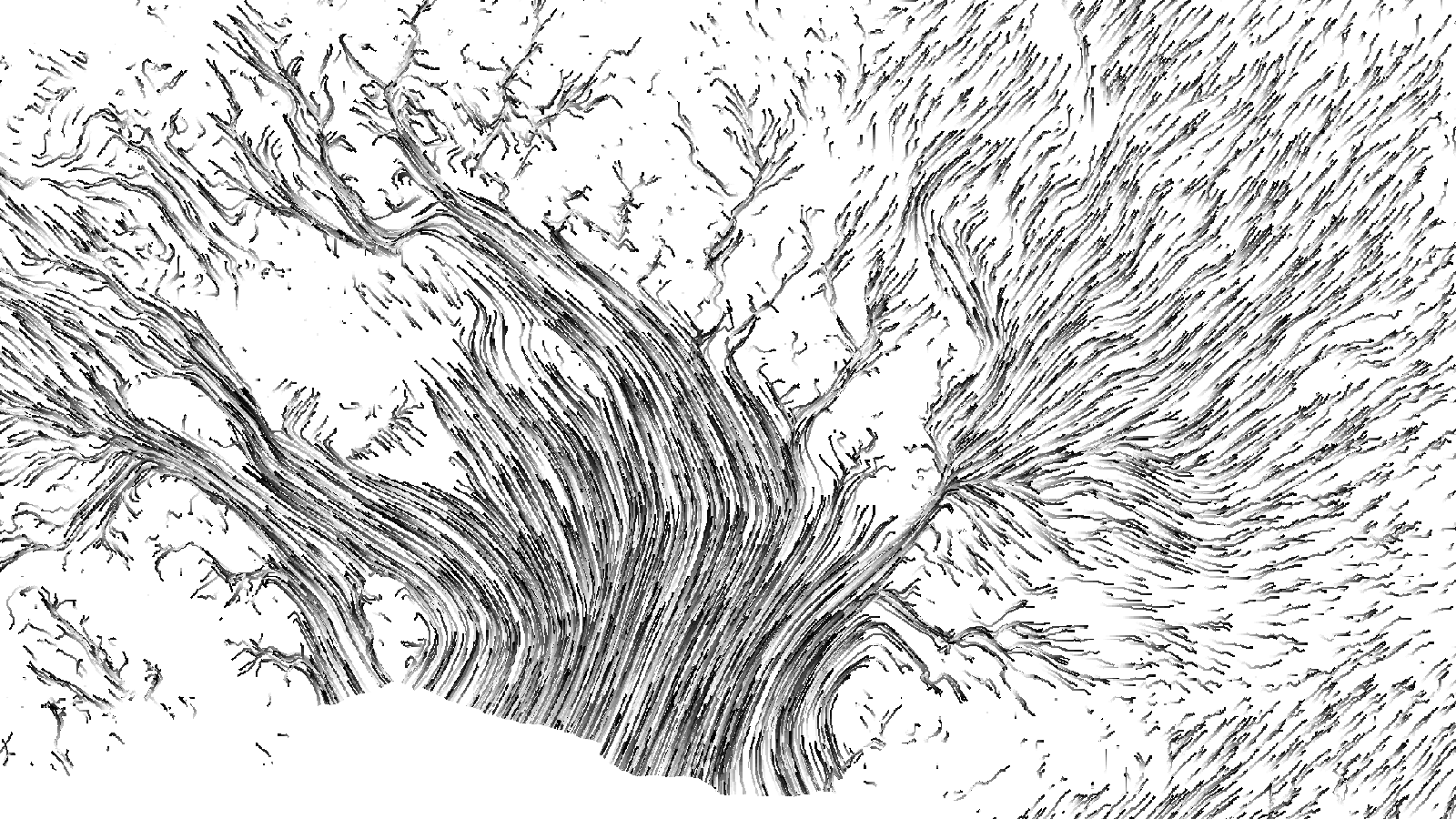
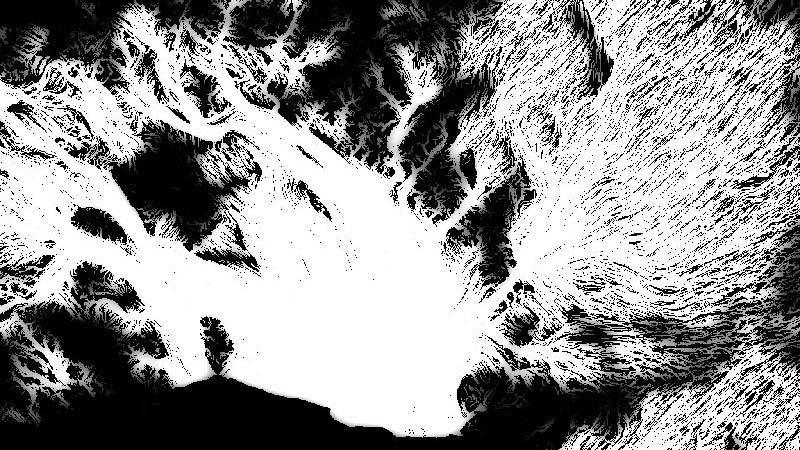
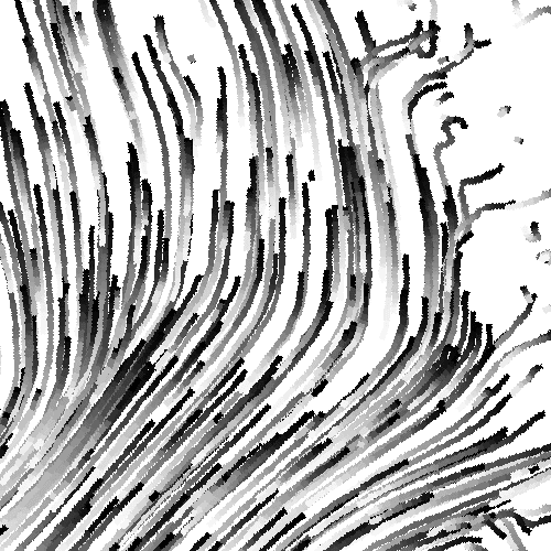
Although our implementation would be different from the old games that used color cycling, the general approach seemed like it could work for our animations. Jeremy adjusted his animation code from the VR films to render static images with black-and-white gradients tracing each path:
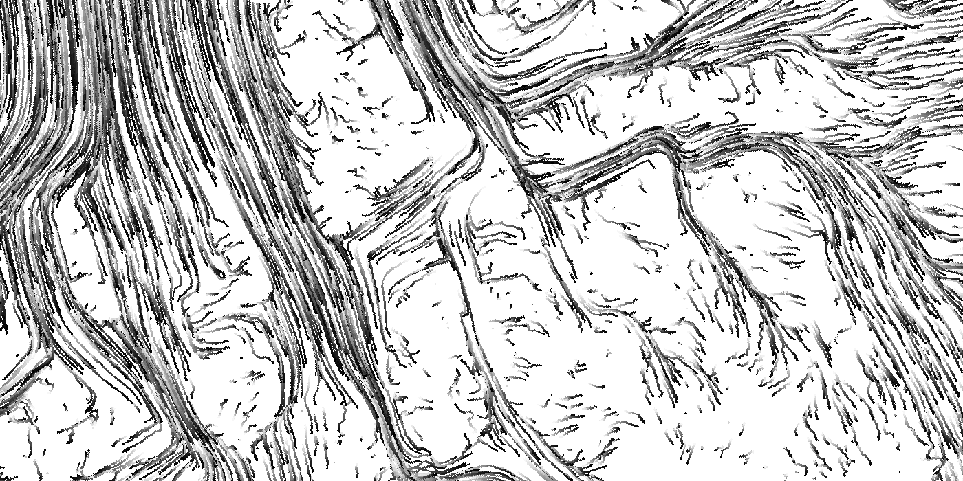
We wrote a program for the GPU (a shader) that efficiently shifts how colors in an input image are displayed over time. When the program first loads, images are drawn to the screen normally: white pixels are white, light gray pixels are light gray, and so on. But as time goes by, the program offsets the colors it uses to draw the input image: white pixels are drawn as light gray, then dark gray, then black.
This creates an illusion of movement along any gradients in the input image. In the flow lines image above, repeating black-to-white gradients for each line encode the speed of the apparent motion: a stretched-out gradient covers more ground, so its colors appear to move faster when shifted. Lines drawn with shorter, choppier gradients animate more slowly.
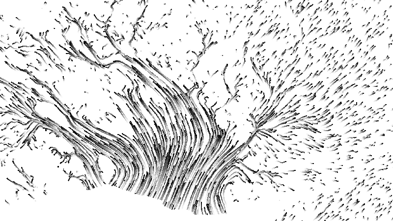
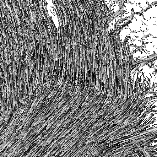
Here's what the input data above looks like when animated using color shifts:
GPU programs are especially fast because they calculate colors for all of the pixels on a canvas in parallel, so we hoped this technique would be speedy enough to give us the look we wanted. Our initial tests were promising, so we ran with it.
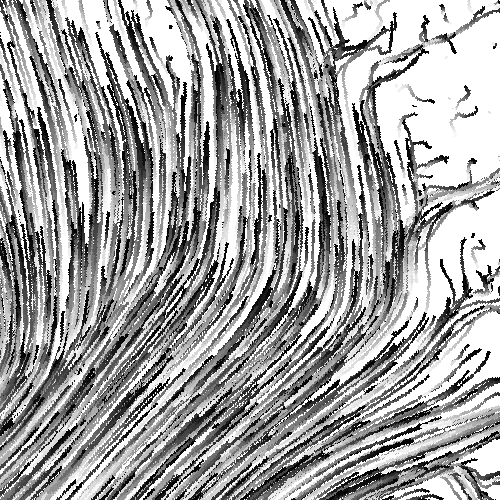
Animating our ice flows in the browser with code also gave us quick, fine-grained control over how the things looked. It let us try different color combinations or speeds just by tweaking a couple of variables:
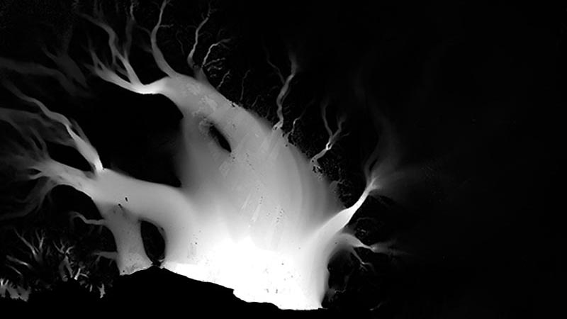
We also layered our input images in the shader, overlaying and multiplying them the same way we would if we were making a static map in Photoshop. This gives a greater sense of depth and complexity:
The end result were rich animations based on data encoded in relatively small, static PNG images. We compressed those images to make them even smaller without much change to the visuals.
In the final graphic we split our input images into several renditions that were loaded based on device resolution and screen size. Download sizes and performance varied, but as a rough guideline, modern phones smoothly animate each map from our story with about 250kb of images, including the base terrain map. That's a few million tons of flowing ice per byte — not too shabby.
There are downsides to using WebGL. It's still a relatively new technology, and rendering things in the browser depends on the reader having decent hardware with a good GPU: this technique doesn't play well with older devices. But in this case animating the flow of Antarctica's ice using shaders gave us what we needed: fast-loading, engaging maps that helped communicate a vital part of the story to our readers. You can see the final product here.
— Derek Watkins
On a deadline, a graphic is successful if it looks nice and communicates well, even if the code behind it is messy. My implementations are probably bad - but at least the maps turned out pretty. I recommend anyone interested in learning more about fragment shaders and graphics processing on the GPU to check out Patricio Gonzalez Vivo and Jen Lowe's Book of Shaders.